Rainier Real Estate Partners
BRANDING & WEBSITE
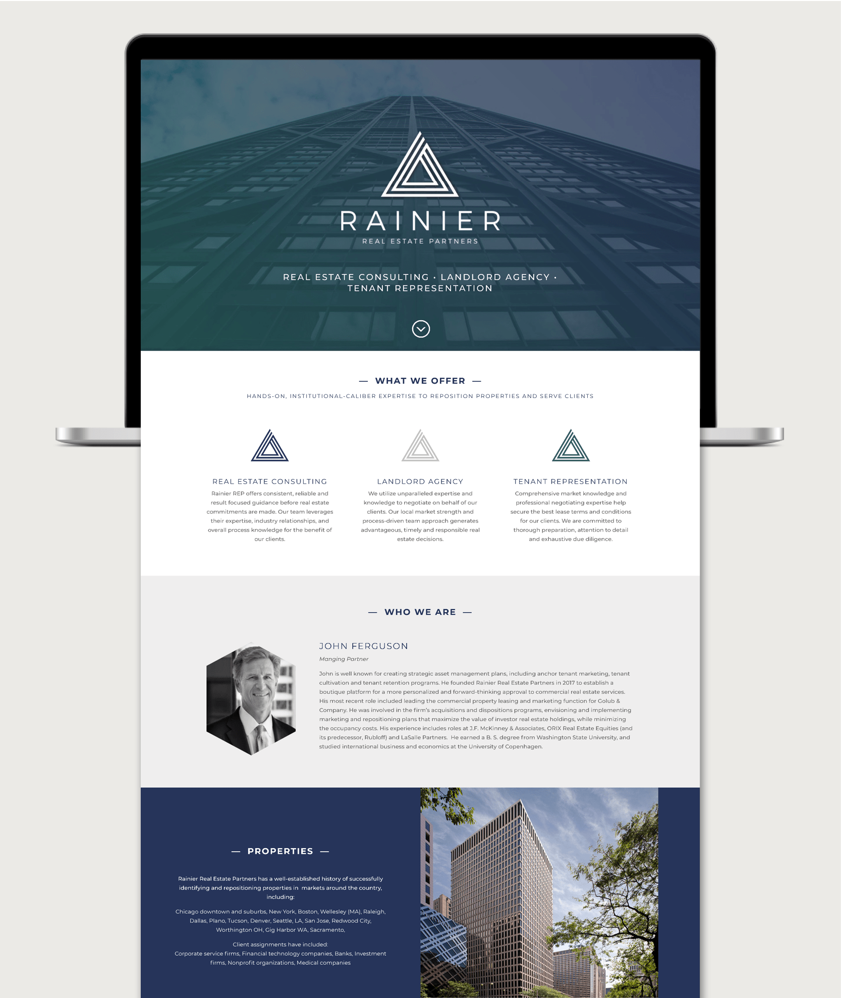
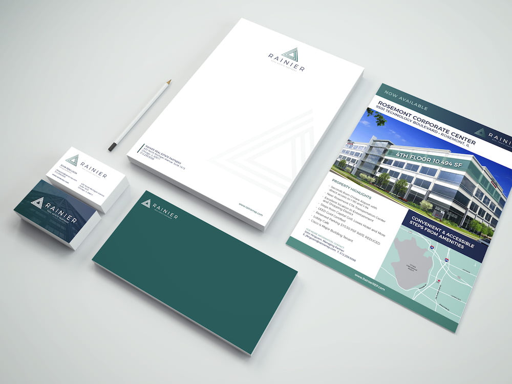
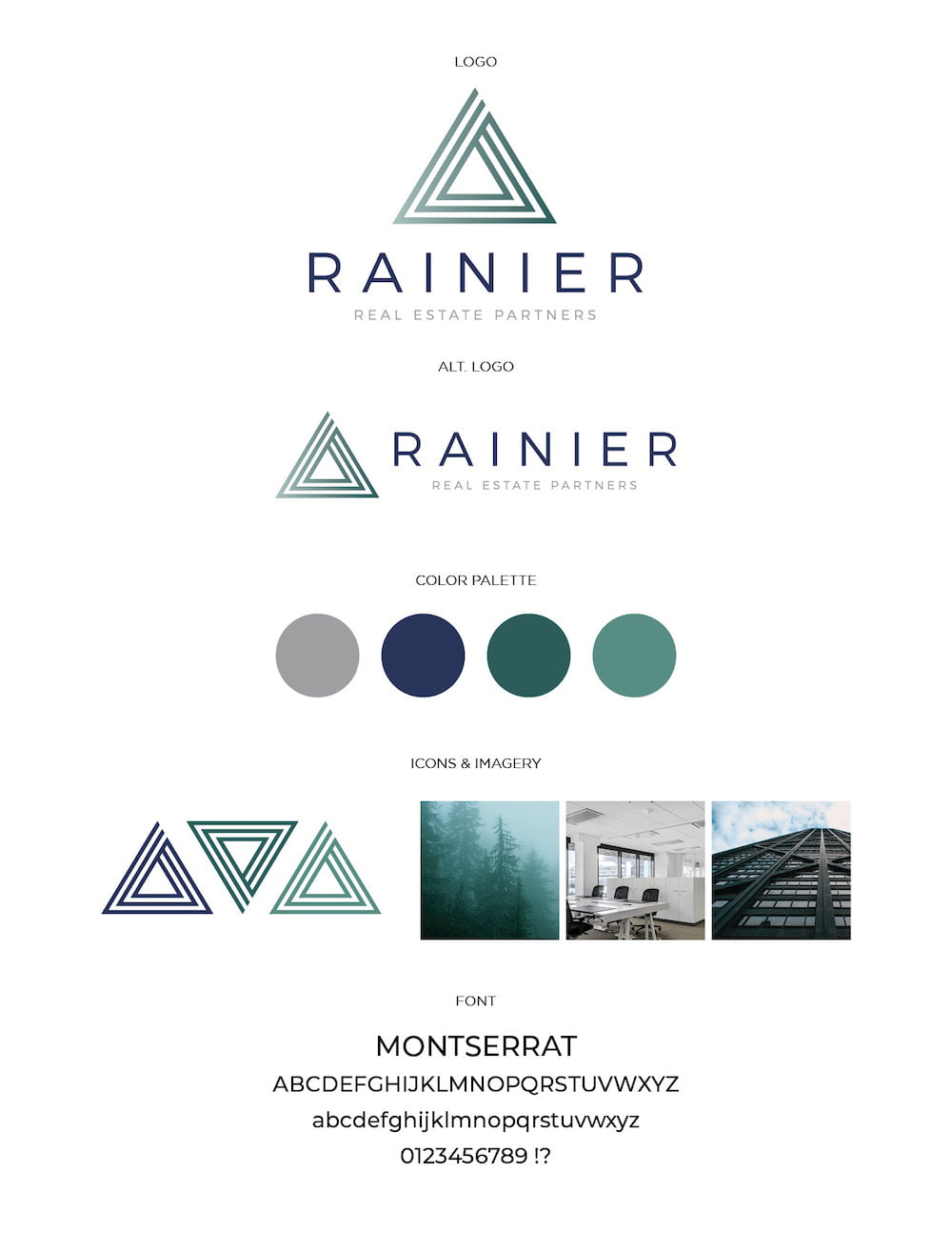
BOUTIQUE COMMERCIAL REAL ESTATE FIRM BRANDING & WEBSITE
When John decided to establish his new commercial real estate services firm in Chicago, he know he wanted a strong brand that would represent his years of experience in the industry, as well as his personal approach influenced by his time in the Pacific Northwest. The ensuing brand development drew from an outdoorsy color palette, tying his business name Rainier (as in Mt. Rainier) to the expansive, modern cityscapes of Chicago. The Rainier REP logomark is reminiscent of the mountain which inspired its name, with a bold, architectural style and multi-layered contour representing the firm’s three primary service offerings. Pairing this with a clean line-based font family and gradient patterns in rich, earth-inspired tones gives the overall brand a fresh, modern look.
- Deliverables: Logo, Business Identity Kit, Flyers, Website
- Link: www.rainierrep.com